Quick question, what do you guys think of the attached cover?
I really love your work on the Society. The Coreships are something Battletech desperately needs given their ability and history of blowing themselves back to the stone ages. I've studied covers and I have lots to say but it's just my opinion. A simple cover has it's own message.
I swear by the rule of 7. You can't have more than 7 elements on a cover or add. Exactly what makes up an element is complicated but generally, any dominating image or line of text but on the back a paragraph can be a single element. Humans have trouble with image recognition and memory after 7 distinct elements. It's why phone numbers were 7 digits before cell phones.
Your covers clock in at a 3-4 while most battletech TROs and Field Manuals covers hit a 6. Their books usually have a number and company logo. It busies up the cover and I think that gives it a more professional look. You could give your books an arbitrary number, or find out how the BTT numbering system works and assign a number. You could also throw up a nod to Catalyst Games, based on material by, or something like that.
I think the Society Field Manual cover could use 1 more piece of art. A small logo or some kind of symbol, outside of the main image. And I would add two elements to the bottom, perhaps on the left and right. One could be the symbol.
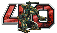
Cover Titles today love being busy. They use raised edges, gradients, images behind text, and usually have a few elements inside them. Take a look at the 35 on this page with the Warhammer in front of it. We've got a gradient inner edge. Raised edge, Gradient outer edge. Gradient filler image with scratches. Inner Drop shadow at about a 45 degree angel. Plus the warhammer.
If you are interested, I'd love to take a shot at one of your covers. I'm not an artist like the fellows making the paintings, but I've done a lot of assembly of elements to produce covers and I'd enjoy the practice.