Author Topic: Illegible Colour Contrasts  (Read 624 times)

deathshadow

  • Lieutenant
  • *
  • Posts: 879
  • Special Tasks Group
    • Cut Code Down - Minimalist Semantic Markup
Illegible Colour Contrasts
« on: 17 November 2023, 12:06:16 »
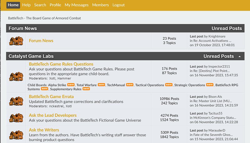
Just to expand on what I said in the dark mode thread, the current template -- the ONLY template you seem to allow now -- as severe accessibility and usability issues. Topping that list of problems being the colour choices. I know, I know, "branding" and all... but seriously:


If this were an essential site, you could be sued for violating accessibility norms with that.  If it were medical, utility, gov't, or even retail, you could even be prosecuted

Be thankful gaming is not such an industry. Even so, such use of colours is a giant "screw you" to large swaths of users. Myself included.

Now, more than just kvetching about it, lemme give you some advice on how to test for that. We have something called the "Web Content Accessibility Guidelines" -- WCAG. The rules it presents (that are being updated) are hard to follow, but there are plenty of automated tools to help with that. The one I suggest is:

https://webaim.org/resources/contrastchecker/

If we plug in that orange (#DAA520) and white (#FFFFFF) we get this:


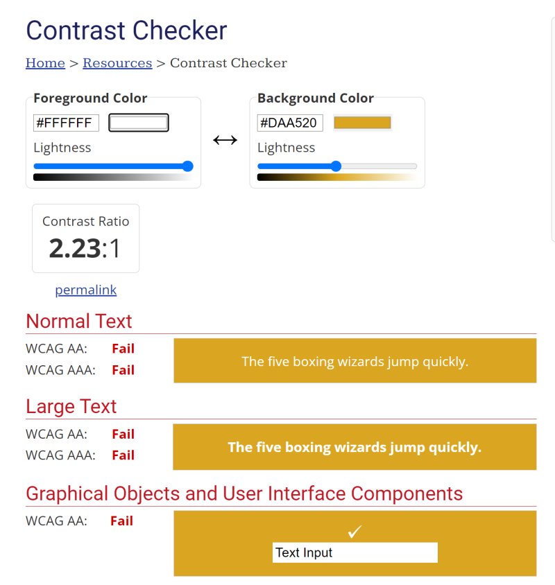
Failure to even meet the bare minimums. Not good in the age of font-smoothing where "large AAA" should be treated as minimum now. (depending on the font in use)

It is NOT a good colour choice.
Death will take those who fight alone.
But united we can break a fate once set in stone.

CUTCODEDOWN.COM

deathshadow

  • Lieutenant
  • *
  • Posts: 879
  • Special Tasks Group
    • Cut Code Down - Minimalist Semantic Markup
Re: Illegible Colour Contrasts
« Reply #1 on: 17 November 2023, 14:19:10 »
Note I didn't notice the colour switcher at the top because it's not labelled and looked more like some random artsy stuff than user interface.

None of them are winners, though the red fixes the menus by making headings even worse.
Death will take those who fight alone.
But united we can break a fate once set in stone.

CUTCODEDOWN.COM

Daryk

  • Lieutenant General
  • *
  • Posts: 37384
  • The Double Deuce II/II-σ
Re: Illegible Colour Contrasts
« Reply #2 on: 17 November 2023, 17:55:27 »
Wait, you default to the Steel skin?  Mine only ever defaults to Lyran, and I have to constantly switch it back... ???

Failure16

  • Captain
  • *
  • Posts: 2354
  • Better Days
Re: Illegible Colour Contrasts
« Reply #3 on: 18 November 2023, 12:41:09 »
Welladay.

I never knew there were choices in the color scheme, and indeed Steel is apparently my default setting. I was this many days old when I found out--and indeed deathshadow is correct that the color-block looks more like a website defect or printer’s color blocks/process control patches--what that strip is for. Amazing!
Thought I might get a rocket ride when I was a child.          We are the wild youth,                                And through villages of ether
But it was a lie, that I told myself                                          Chasing visions of our futures.                   Oh, my crucifixion comes
When I needed something good.                                         One day we'll reveal the truth,                    Will you sing my hallelujah?
At 17, I had a better dream; now I'm 33, and it isn't me.      That one will die before he gets there.       Will you tell me when it's done?
But I'd think of something better if I could
                           --E. Tonra                                                      --C. Love
--A. Duritz

Wrangler

  • Colonel
  • *
  • Posts: 25041
  • Dang it!
    • Battletech Fanon Wiki
Re: Illegible Colour Contrasts
« Reply #4 on: 18 November 2023, 20:51:09 »
I prefer "Steel" since I don't like bright colors (eyes wise)
"Men, fetch the Urbanmechs.  We have an interrogation to attend to." - jklantern
"How do you defeat a Dragau? Shoot the damn thing. Lots." - Jellico 
"No, it's a "Most Awesome Blues Brothers scene Reenactment EVER" waiting to happen." VotW Destrier - Weirdo  
"It's 200 LY to Sian, we got a full load of shells, a half a platoon of Grenadiers, it's exploding outside, and we're wearing flak jackets." VoTW Destrier - Misterpants
-Editor on Battletech Fanon Wiki

Failure16

  • Captain
  • *
  • Posts: 2354
  • Better Days
Re: Illegible Colour Contrasts
« Reply #5 on: 18 November 2023, 21:23:40 »
And I guess it is irrelevant--to me. Since if I refresh the page, it reverts back to the only Steel I have known. Seems silly to change it to say, FWL Purple, only to have it continually change back to Steel.

But sure, I dig the dark grey, too.
Thought I might get a rocket ride when I was a child.          We are the wild youth,                                And through villages of ether
But it was a lie, that I told myself                                          Chasing visions of our futures.                   Oh, my crucifixion comes
When I needed something good.                                         One day we'll reveal the truth,                    Will you sing my hallelujah?
At 17, I had a better dream; now I'm 33, and it isn't me.      That one will die before he gets there.       Will you tell me when it's done?
But I'd think of something better if I could
                           --E. Tonra                                                      --C. Love
--A. Duritz

Broken_Metal_Dreaming

  • Private
  • *
  • Posts: 45
Re: Illegible Colour Contrasts
« Reply #6 on: 12 January 2024, 17:49:39 »
Edit: Republic of the sphere dark mode is up again in the modify profile look and layout section under theme again. Down at the bottom. Thanks  devs!
« Last Edit: 12 January 2024, 17:58:33 by Broken_Metal_Dreaming »