I'm happy with the new look Marauder II, sure it could be a bit more Marauder-e but otherwise its fine. The original model was horrific. It was a Marauder with longer legs, so it stuck its ass out backwards, with dinky little wings strapped to the sides that ALWAYS fell off. And the mech ALWAYS fell over onto its ass because it was grossly imbalanced and even putting a 2p piece under it didn't help. As for the whole 'reinforced', bulking up the superstructure and internals to make it heavier would probably result in a bigger and different looking Mech.
For the most part, the Kickstarter has tried to stay true to the original art and rough designs, but made it so it looks like the Mech's wouldn't shear their legs in half or have a hip joint somewhere where a human's upper intestines would be. Where they've been more radical is with Mech's that needed it, Bishop Steiner's lovely take on the Mercury for example, saved a Mech that NEEDED work as the original one was 'where's its cockpit? Does it have a hip?' and I'll assume that the King Crab is based on the MWO/MW-5/B-tech game version rather than the butt ugly hubcab going :D
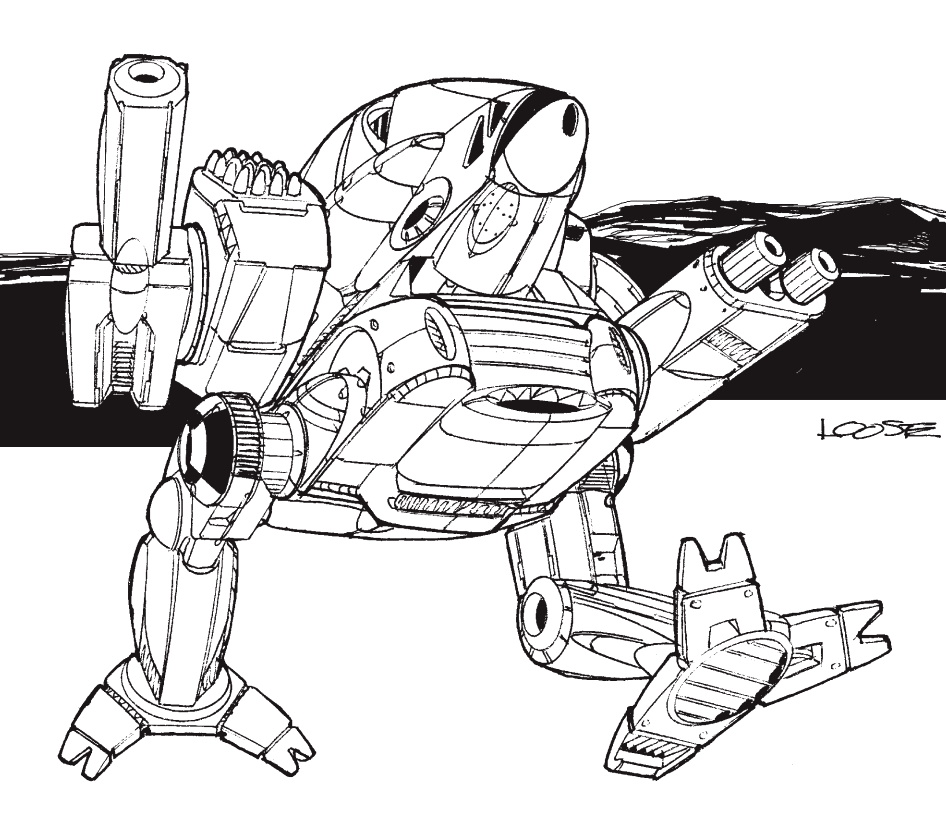
This was BADLY needed for the IS Mechs that were NOT the Unseens, yes Loose's art is iconic and helped make the setting, but its aged badly and a lot of the stuff he drew looks like it would fall over in a stiff breeze or rip itself apart if it dared twist the torso.
The Clan Mech's, the 3050 one's needed updating and more nice, lovely details, the 3058 ones like the Black Lanner etc, they needed serious work in most cases whereas some didn't, the Battle Cobra and Supernova for example are fine and are more a case of needing updating to modern standards. But a case in point, I'll challenge anyone to tell me that this is passable art now in this era where things live and die on first impressions, and where good models, good art help sell a game as much as its ruleset or writing.
the re-do is much closer to the TCG art

Which looks WAY better than the original design.