Wow, so many posts! :o Not going to quote everything or everyone because I'd be here all day #P
First I'd like to say that I am absolutely 100% not claiming that 40k minis are more realistic/practical or that style is what I want to see in BTech. I brought up 40k because their models have bolder and easier to identify details. When I look at a Space Marine there's all sorts of interesting and easily identifiable details, the bolter has ejection ports, mag releases, what's probably a safety, etc. Compared to that 'Mechs tend to be very plain.
I don't know how many of you have heard of Star Citizen (
https://robertsspaceindustries.com), it's a PC video game that's currently in development. A year ago they started a competition for fans to design a space ship for the game. The judges would review and critique designs every week giving great feedback and occasionally eliminating a design from the competition. One thing that came up a lot was "shape language," and how if a design has a very simple silhouette, it then needs to have interesting details to keep the eye interested and moving. If a design has a very interesting and dynamic silhouette it's details need to be more simple to allow the eye to rest. A good example is the X-wing vs the Y-wing, the X-wing has a very interesting silhouette so it's details tend to be muted and most of the ship is smooth. The Y-wing on the other hand has an extremely simple and basic silhouette, but most of the panels are ripped off and reveal all sorts of piping and other equipment, it's large number of details complement and balance the simple silhouette.
To me that's the problem with a lot of the 'Mechs, their details aren't prominent or interesting enough to impact the overall shape language. Whereas a lot of the 40k stuff balances that very well, though of course some of the 40k stuff goes in the other direction with too much detail on an already interesting silhouette.
And again I'm not trying to come in here and trash the stylistic choices of the BattleTech universe as overall I really like BTechs style (except the 80's stuff >:D). I'd just like to see better shape language, bolden up some details so that you get a nice balance between the silhouette and details, add in some functionalish bits. Not to change the style, but to highlight it.
Yes I do feel that many of the old designs are horrible aesthetically, the ones in the original TRO3025 have some especially egregious designs, Firestarter and Enforcer leap to mind instantly. How are those joints supposed to move? There's not discernible joint lines, or areas for myomer to extend through! Of course it's not just old designs that can be horrible, a lot of the computer generated Dark Age stuff is
worse! Random pieces of equipment and weaponry stuck on at random like Lego's, with zero thought as to how they would interact or take a hit!
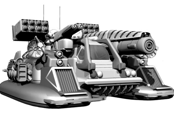
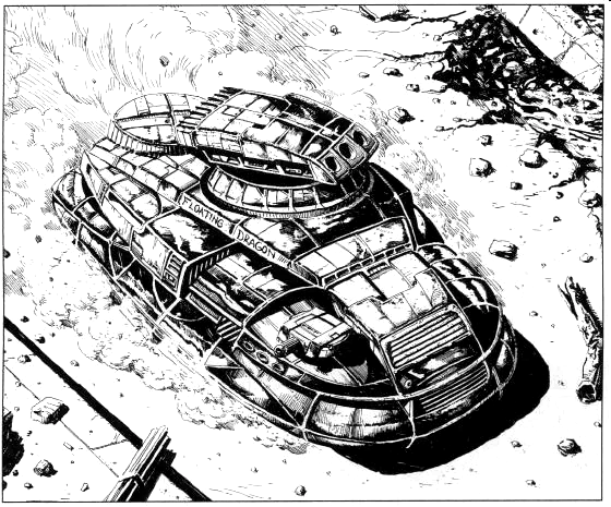
Personally I don't care whether a setting uses cartoon, photo realistic, or a larger than life aesthetic. Granted I much prefer photo realistic, and I'd rather have larger than life (40k) than cartoonish, but there are only two things that I really want: consistency and plausibility. Consistency, if you're going to create a setting pick a style and then stick with it, don't jump around at random. Plausibility, take some time when you're designing something to ensure it has at least the appearance of working and isn't just a random mashing of parts that looks like one good shot would knock it apart. Example the Condor:
Old Condor looks halfway plausible:
New Condor doesn't even look like it'd work, let alone well: